Salary Prediction
project utilized Python and SparkML to analyze and visualize employee salaries across industries, applying machine learning models to predict salary trends based on experience and industry metrics
Overview
- Mined and cleaned data from over 1 million records using SparkML and SparkSQL following the ETL process and Label Encoding method.
- Built and trained 5 regression machine learning models to predict the salary to find the best-predicted salary model based on backgrounds by comparing RMSE and R-squared scores. The model with the best scores has an R-squared of 74.88%.
- Please visit the project using this link to my notebook.
Details
Data Profile:
For this project, I used the Employee Salaries dataset from Kaggle, containing nine columns and 1,000,000 rows. This dataset features employee details related to salaries. My goal was to predict salaries using the initial eight features, and I also created visualizations to understand relationships within the dataset.
Data Transformation:
Data transformation involves changing data structure and format. It’s vital for enhancing business and analytic processes. There are four types of transformations: aesthetic (standardizing data), constructive (adding or replicating data), destructive (deleting data), and structural (altering database structure). The process includes extraction from sources, transformation through cleansing, standardizing, and other tasks, and then loading into a database.
For this project:
- I loaded the data from Kaggle to a Google Notebook.
- Merged separate training and actual salary datasets.
- Used PySpark SQL for easy data extraction and similarity to SQL language.
- Removed rows with unlikely $0 salaries for high-paying roles.
- Created a cloned data frame without the “jobID” column.
- Performed label encoding for the “degree” feature and One-Hot Encoding for other categorical features.
- Prepared data for machine learning by combining features into a single “features” column.
- Divided the data into training and testing sets. After experimenting with various ratios like 50-50% and 70-30%, I settled on a 99.5-0.5% split, giving me over 994,000 training examples and about 5,000 test examples. The choice was driven by the observation that a larger training set improved the R-squared score.
(Note: The detailed explanation on R-squared scores for different ratios seems to be visual in nature, provided through screenshots, and hence can’t be summarized without seeing the actual content.)
Visualizing and Analyzing the Dataset
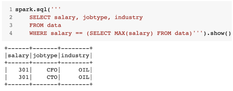
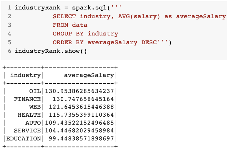
- Dataset Overview I began by employing SQL queries to identify various insights such as the highest-paid job, the top 10 highest/lowest-paid jobs, and ranking industries based on salary. A clear example of this is illustrated in diagram below, where I identified that the maximum salary amounting to $301k is affiliated with the CFO and CTO roles in the Oil industry.
- Key Findings from the Visuals
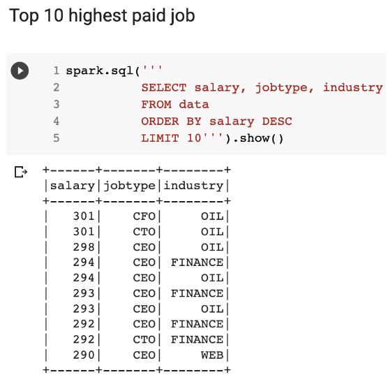
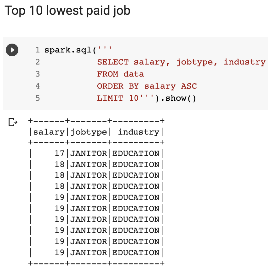
- High and Low Salaries: The two screenshots below delineate the top 10 highest and lowest paying roles. A majority of the high-salary roles are dominated by the Oil and Finance sectors. Conversely, roles with the lowest salaries unanimously hail from the Education sector.
- Industry Salary Rankings: I further ranked industries based on their average salaries and found, that the Oil industry topped the list with an average exceeding $130K, whereas the Education sector recorded the lowest near $100K.
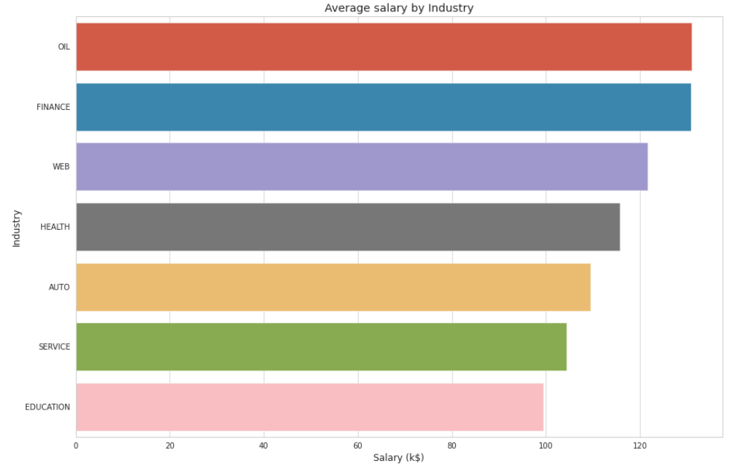
- Salary Visualization: I translated the industry salary rankings into a more digestible format using a horizontal bar chart. This visual representation accentuates the salary variations across different industries, with the Oil, Finance, and Web sectors leading.
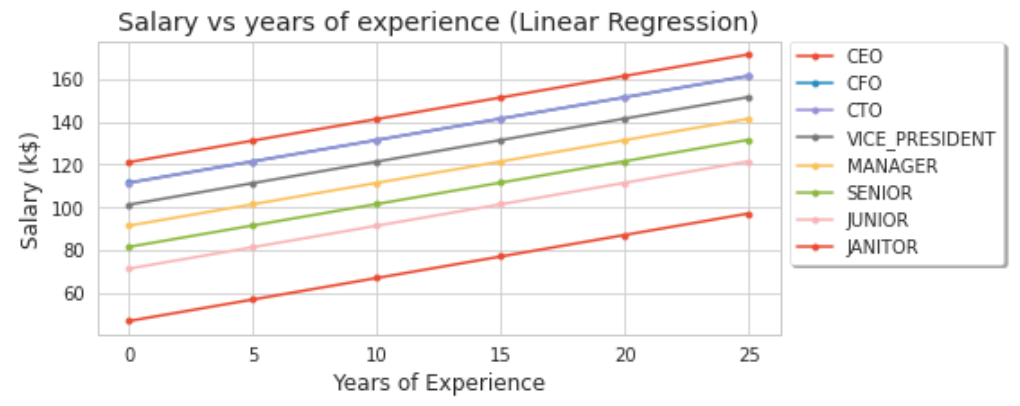
- Experience vs. Salary: To discern any correlation between an employee’s years of experience and their salary, I constructed a line graph. Generally, salary tends to increase with experience, albeit contingent on factors like the employer, role, job specifics, etc.
- Interesting Code Snippets In the coding segment of the project, I integrated PySpark for machine learning purposes. Our focus was on two models: Gradient Boosting Tree Regression (due to its superior prediction capabilities for our dataset) and Linear Regression (owing to its ubiquitous use in machine learning).
Note: Despite the simplicity of the associated codes, running each model took about 30 minutes given the substantial dataset size.
Evaluation Metrics:
- RMSE: This metric gauges the mean disparity between predicted and actual values in a dataset. A lower RMSE implies a more fitting model.
- R-squared (R2): This measures how much variance in the response variable can be attributed to predictor variables. R2 values range between 0 and 1, with a higher value indicating a better model fit.
I will delve deeper into the prediction outcomes and these metrics in Section 8.
Results and Insights
Here, I showcase the predictions from my machine-learning model. The correlation between actual and predicted salaries implies that as the former rises, so does the latter. Figures below present scatter plots comparing actual salaries against those predicted by the Gradient Boosting Tree Regression and Linear Regression models, respectively.
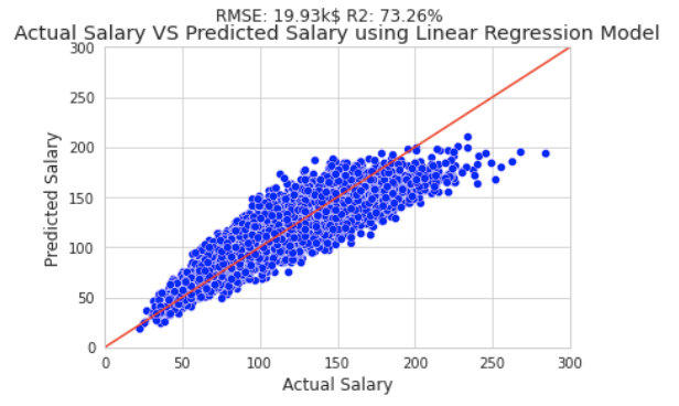
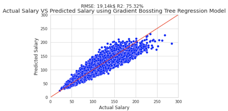
Apart from the two primary models, I also explored three others: Generalized Linear Regression, Decision Tree Regressor, and Random Forest Regressor. In terms of RMSE, the Gradient Boosting Tree Regression model stood out as the most accurate, while its counterpart, the Decision Tree Regressor, recorded the least precision. Conversely, for the R2 score, the Gradient Boosting Tree Regression model ranked the highest.
Moreover, my project employed the CRISP-DM approach, encapsulating processes ranging from understanding the business and data to data preparation, modeling, evaluation, and deployment.